Exploring Ticket Prices
Here’s an two-way table sports example. If you attend any professional sports event in the United States, you’ll see that it can be quite expensive, especially if you consider the total cost, including tickets, travel, parking, and food. That raises several questions:
(1) how does the average ticket price vary across cities?
(2) how does the average price vary across different professional sports?
On the fan cost Team Marketing Report website, we find the average ticket price for all professional teams in different sports. I collect the average prices for five cities and for four sports (basketball, football, baseball, and ice hockey).
In R, I create a matrix with rows corresponding to cities and columns corresponding to sports. Note that I use the dimnames function to provide labels for the rows and columns.
ticket.prices <- matrix(c(98.69, 88.53, 108.44, 122, 111.69,
                          37.42, 32.59, 44.16, 52.32, 51.55,
                          39.25, 35.50, 77.65, 72.64, 129.38,
                          74.65, 67.06, 78.80, 88.70, 77.87),
                          nrow=5, ncol=4)
dimnames(ticket.prices)[[1]] <- c("Philadelphia", "Minnesota",
                                  "Chicago", "New England", "New York")
dimnames(ticket.prices)[[2]] <- c("NFL", "MLB", "NBA", "NHL")
ticket.prices
##                 NFL   MLB    NBA   NHL
## Philadelphia  98.69 37.42  39.25 74.65
## Minnesota     88.53 32.59  35.50 67.06
## Chicago      108.44 44.16  77.65 78.80
## New England  122.00 52.32  72.64 88.70
## New York     111.69 51.55 129.38 77.87
I reorder the rows and columns so the cities are in order, from cheapest to most expensive, and likewise the sports are in order with regards to cost.
ticket.prices <- ticket.prices[c(2, 1, 3, 5, 4),
                               c(2, 3, 4, 1)]
ticket.prices
##                MLB    NBA   NHL    NFL
## Minnesota    32.59  35.50 67.06  88.53
## Philadelphia 37.42  39.25 74.65  98.69
## Chicago      44.16  77.65 78.80 108.44
## New York     51.55 129.38 77.87 111.69
## New England  52.32  72.64 88.70 122.00
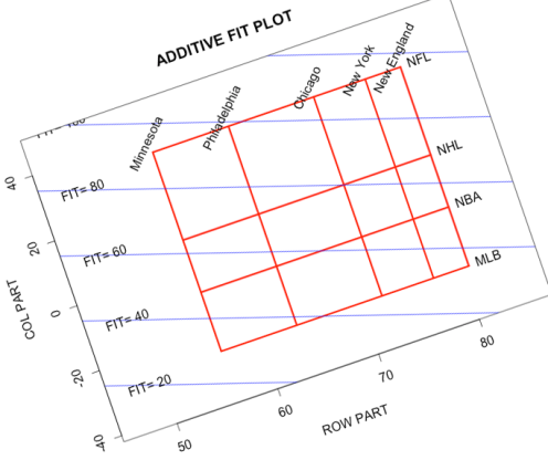
I use the medpolish function to perform an additive fit to this table. I display the fit, and also plot the fit using the plot2way function in the LearnEDA package. (By the way, I used a graphics application to rotate the display so that values of the fit are horizontal lines.)
fit <- medpolish(ticket.prices)
## 1: 192.34
## 2: 135.2
## Final: 135.2
fit
##
## Median Polish Results (Dataset: "ticket.prices")
##
## Overall: 72.0625
##
## Row Effects:
##    Minnesota Philadelphia      Chicago     New York  New England
##     -15.9525      -8.4575       0.0000       5.1075       8.6075
##
## Column Effects:
##     MLB     NBA     NHL     NFL
## -26.185  -8.030   8.030  35.085
##
## Residuals:
##                  MLB     NBA     NHL     NFL
## Minnesota     2.6650 -12.580  2.9200 -2.6650
## Philadelphia  0.0000 -16.325  3.0150  0.0000
## Chicago      -1.7175  13.618 -1.2925  1.2925
## New York      0.5650  60.240 -7.3300 -0.5650
## New England  -2.1650   0.000  0.0000  6.2450
library(LearnEDA)
plot2way(fit$row + fit$overall, fit$col,
  dimnames(ticket.prices)[[1]],
  dimnames(ticket.prices)[[2]])
Here are some comments about the fit and the residuals.
- The additive fit is helpful for understanding differences in average ticket prices between cities and between sports. As expected, tickets are most expensive in New York and New England. The differences are substantial. For example, on average, ticket prices are over $24 higher in New England than Minnesota. Also, football is the most expensive sport, followed by hockey, basketball, and baseball. By looking at the column effects, we can say, for example, that average ticket prices tend to be $16 higher for hockey games than basketball.
- Does the additive fit explain the variation in the average ticket prices? To answer this, we look at the residuals. Most of the residuals look small (relative to the sizes of the row and col effects), but several residuals are large. For example, basketball tickets in New York look unusually high, and basketball tickets in Philly seem unusually low.
- It is not clear here if it is best to use an additive fit. When we think of changes in ticket prices, typically we talk in terms of percentage increase or decrease. For example, one might hear that the Cavaliers raised their prices by 20% this year. So it might make sense to use a multiplicative fit for this data.

Comments are closed.