This week you’ll be working on datasets that are clearly non-symmetric and finding power transformations helpful in making them approximately symmetric.
There is more reading for this assignment, but from past history, I think this particular assignment will be okay. Here are some tips for success (and a good grade!).
- Try Several Methods. From the notes, you’ll see several methods for assessing nonsymmetry of the raw and reexpressed data. I strongly suggest that you try several methods. Of course, you need to display a histogram or other graph of the data — one to convince yourself that the raw data is in need of a reexpression and a second to show yourself that your recommendation reexpression actually works.
- Please Choose Reasonable Datasets. In the second part of the assignment, you are choosing datasets that deserve reexpression. It is probably easiest to find dataset that are strongly right-skewed — batches of counts are typically skewed. A dataset is likely skewed if the ratio of the max to the min is large. If you choose a poor dataset, that is a dataset that really is not strongly right skewed, your work really is not going to work out very well and your instructor will not be pleased.
- Look at More Examples. On this blog, I have a number of new examples where I illustrate reexpression for symmetry. Look at them, especially if you are confused about the process.
- Ask Questions. I’ll be in Boston early part of this week, but I’ll be around in the office on Wednesday if you want to drop by. Friday afternoon is not the best time to ask general questions which indicate some big misunderstandings. Of course, emailing is fine and I’ll try to respond promptly.
Comparing Batches
I recently finished grading your “comparing batches” homework and here are some remarks on some common issues where you lost points.
Issue 1: What is the Point of the Assignment?
We want to compare batches in a simple way. A simple comparison is say something like “Batch 2 tends to be 10 smaller than Batch 1”. We can make a simple comparison when the batches have similar spreads. In both of your problems, this wasn’t the case. The reason why we did all of the work (construct a spread vs level plot, etc) was to find a reexpression so that the is not a dependence between spread and level and the batches have similar spreads on the new reexpressed scale. If you have found a reasonable reexpression, then please compare the batches on the new scale. It is not okay to say that one batch is larger than another batch — we’d like to know how much larger. Many of you didn’t do this on your homework.
Issue 2: Did My Reexpression Work?
The reason why we reexpress is to remove the dependence between spread and level. How can one check if the reexpression works? Well, just construct a new spread-level plot on the reexpressed data and comment if there remains a dependence between spread and level. If there is some dependence, suggest the choice of a new reexpression that may help.
Issue 3: Be Nice to Your Grader
I am grading your homework and I really appreciate if you give me what I am calling “tidy work”. Here are some characteristics of tidy work:
- Just display the relevant R work. Don’t show me anything that is not relevant to what is being asked.
- Always explain what each graph is showing us. I don’t like naked graphs that have no accompanying explanation.
- Explain, explain, explain — I will never take points off if you write too much.
Last, please contact me if you don’t understand the question or if you have any R issues. It is not acceptable to simply say “this function didn’t work” on your homework. Generally, I try to be quick in responding to student requests.
Your Assignment this Week
Wait … it appears that you don’t have any work due this week. Enjoy the cooler weather and we will be looking at reexpressions more thoroughly next week.
EDA Trivia Question — send answer to albert@bgsu.edu
One of John Tukey’s collaborators was a famous British statistician who taught at Yale. (Hint — this statistician is famous for his “quartet”.) . This collaborator wrote a book on statistical computation using a particular programming language. What was the name of the statistician and name of that programming language?
You have a “comparing batches” assignment due this week. In many years of teaching this class, this particular assignment has been problematic — students don’t seem to get the main points. So that inspired this week’s video. (To save time, I typically just do this videos in one take so there might be some typos in my presentation.)
For this week, I thought I’d try something different — a video.
Let me know if you like this or not (some students are more visual learners).
Your turn-in
Generally you found interesting datasets and were successful in creating csv files in your first assignment. But here is some advice that will help you avoid some issues when you want to work with your datasets in R.
- First, use simple names (short with no blanks or special characters) for variable names — it will then be easier to work with these variables.
- Some of your data values contain commas, dollar signs, etc. You want to remove them before you bring the data into R. You don’t have to remove these weird values if you are comfortable doing string manipulation in R, but I suspect that most of you are not familiar with these data science skills.
- Generally, you want your dataset to be clean. Eliminate any variable from your dataset that will not be used.
Making life easier
Your “Single Batch” assignment can be a bit tedious since it requires you to find outliers using a particular procedure. (You have to find the five number summary, compute the quartile spread and a “step”, set up fences, etc.) . To make this process easier, I just added a new function “lval_plus” to my LearnEDAfunctions package that will compute the fences and locate the outliers — you can use this function either for a single data frame and variable, and for a data frame with a numeric variable and a grouping variable (this will locate outliers for each group). I added a document “Finding_outliers.html” which illustrates the use of this new function.
My rubric
I don’t use a formal rubric when I grade assignments. But I am more interested in your explanation and interpretation and less interested in your R work. (In my experience, students tend to do well in the mechanics of implementing methods and not as well in explaining what you learn from the R work.) . I rarely criticize a student for writing too much.
Welcome to Exploratory Data Analysis! I’ll be using this blog to provide weekly announcements and general help on working through this class. Generally I will post early each week, telling you want is expected in the assignment due on Friday.
To get started …
- Look over the Canvas material including the syllabus that describes how this course works.
- Generally assignments are due on Friday (yes, you can work until midnight — in fact, it seems common for students to work late in the evening).
- I am assuming some basic knowledge of R, but all of the R code that you see in the lecture notes is available by downloading and unzipping the zip file. If you have specific R questions, the easiest thing is to ask me by email. (Or you can google your question, but it can be frustrating finding the answer you want.)
- There is a package
LearnEDAfunctionsthat contains the class datasets and some special functions. If you have already installed the devtools package, then you just type:library(devtools)
install_github(“bayesball/LearnEDAfunctions)to install the package from my Github site. To see if you have the package installed, try typinglibrary(LearnEDAfunctions)
head(beatles) - If R complains when you do step 4, I am thinking that there is some issue with the aplpack and vcd packages that I am using with my package. So if step 4 doesn’t work, try instead to install the
LnEDAfunctionspackage (this is justLnEDAfunctionswith those two other packages removed).library(devtools)
install_github(“bayesball/LnEDAfunctions)Based on a sample of size 1 (that is, one student), I think step 5 can work when step 4 doesn’t. - (ADDED AUGUST 28) Based on more experience, it appears that the problem is with the installation of the aplpack package. If you have a Mac, you need to first install xquartz. Then you should be able to install Learn EDA functions.
I will be available Monday (10 to 2), Tuesday (10 – 11, 1 – 3), and Wednesday (10 to 2) if you want to stop by my office in 407 Math Science.
The Tukey resistant line is one method of fitting a line that is resistant or insensitive to outliers. Actually, there was a time when “robust” fitting was a popular research topic and there are a number of procedures for implementing this type of fitting. Here I describe a simple way of improving the least-squares fit to make it more resistant to outliers.
I’ll use some data from the popular mtcars data frame in R. I’ll choose a subset of the data and introduce an outlier
MTcars <- filter(mtcars[, c("wt", "mpg")], wt > 2.3, wt < 4.5)
MTcars <- rbind(MTcars, data.frame(wt=2.2, mpg=13))
Below I fit a least-squares line and show the data together with the line. There is one obvious outlier (point in the left bottom of the plot) that may have an influence on the least-squares fit.
library(ggplot2)
ggplot(MTcars, aes(wt, mpg)) +
  geom_point() +
  geom_abline(intercept=fit1$coef[1],
              slope=fit1$coef[2])

Here’s the method:
1. Find the residuals for all of the points. Assign a weight to each point according to the formula
where 

point_weights <- (1 + fit1$residuals ^ 2) /
  (1 + sum(fit1$residuals ^ 2))
2. Perform a weighted least-squares fit, where the weights are the reciprocals of the 
fit2 <- lm(mpg ~ wt, weights=1 / point_weights, data=MTcars)
The outlying point will be downweighted in the weighted-least squares regression.
To show that seems to work, here is a graph of the plot, showing both the original least-squares line and the “robust” line.
ggplot(MTcars, aes(wt, mpg)) +
  geom_point() +
  geom_abline(intercept=fit1$coef[1],
              slope=fit1$coef[2]) +
  geom_abline(intercept=fit2$coef[1],
              slope=fit2$coef[2], color="red") +
  ggtitle("Data with Robust Fit Added")

This type of robust regression method is implemented in one of the many R functions currently available.
Just finished grading your EDA symmetry assignment. If you want to lose points on future assignments, I thought I’d provide some tips. (After all, high grades are overrated, right?)
Losing Points Tip 1 — How you begin …
You will lose an automatic 3 points on your next assignment if you start your writeup with
library(LearnEDA)
or some other R code.
Losing Points Tip 2 — Doesn’t R speak for itself?
Another way to lose points is to show your instructor a lot of R code, output, and graphs without any explanation. Your instructor really doesn’t know what you are communicating or why you included particular output.
Losing Points Tip 3 — Poor English
Try communicating in your assignments using sentence fragments or misspellings. After all, text messages and tweets are great — why not use them in a EDA assignment?
Losing Points Tip 4 — Choosing poor datasets
Is this an example of a “poor dataset”?

No, what I mean is a dataset that can not used to illustrate the particular EDA method.
For example, if want to illustrate the benefit of reexpression to achieve symmetry, chose a dataset that is already symmetric or has a small range (values of max / min is small). You’ll have a lot of fun working with reexpressions, but you won’t accomplish much.
Losing Points Tip 5 — Thinking that this is a math class
Some of you have a math mentality in that you think there is a precise answer to a statistical problem. For example, in making a dataset symmetric, you find that p = .34265 does the “best” job. Well, in most applications, a root or a log will work — there is little reason to choose a strange power. Anyway, when you think this is a math class, you might spend too much time on mathematical issues and too little on statistical issues.
I recently found some interesting data about snowfall in Central Park. I put the data into a Google spreadsheet.
Suppose that I wish to compare all of the snowfall amounts of March, the amounts of April, etc.
The problem is that the data is not in the right format for R. The columns contain the months when really I would prefer to have a Month column containing the different months (Jul, Aug, etc.) and a Snowfall column containing the snowfall amounts.
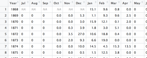
There is a package tidyr that is designed to put this type of “repeated measures” data into the right format.
The gather function will create the type of stacked data that I need. There are three arguments in the function:
- Month is the name of the new column (containing the months)
- Snowfall is the name of the numeric variable (the snowfall amounts)
- -Year means that I use all variables besides Year to fill up the Snowfall column
We see from the display that we have the format we want.
library(tidyr)
ss <- snowfall %>%
  gather(Month, Snowfall, -Year)
head(ss)
  Year Month Snowfall
1 1868   Jul       NA
2 1869   Jul        0
3 1870   Jul        0
4 1871   Jul        0
5 1872   Jul        0
6 1873   Jul        0
Now I can use ggplot2 to construct boxplots comparing the snowfall for the different months. (I use the factor function to specify a reasonable ordering of the months.)
ss$Month <- factor(ss$Month,
                   levels=c("Jul", "Aug", "Sep", "Oct", "Nov", "Dec",
                    "Jan", "Feb", "Mar", "Apr", "May", "Jun"))
library(ggplot2)
ggplot(ss, aes(Month, Snowfall)) + geom_boxplot()

The EDA students should recognize that it is difficult to compare the snowfalls for the different months due the varying spreads. If one looks at the boxplots of a suitable reexpression of the snowfall amounts such as square root, then one is more able to compare the snowfalls for different months.
Here we illustrate the use of the ggplot2 package in constructing graphs to compare groups of numeric data. We’ll discuss some familiar and some not-as-familiar graphs for this purpose.
The Story
Supposedly home run hitting in baseball has increased this year — in fact I read that there were more home runs hit in the month of August than in any other August in baseball history. I’ll focus on the number of home runs hit by a team per game — I’ll call this the home run rate.
Two questions.
Q1: Are team home run rates different in the seasons 2016, 2015, 1986, 1971? (I chose seasons 15 years apart.)
Q2: If the answer to Q1 is “yes”, can I quantify the differences between seasons?
The Data
The R code below collects the appropriate data. I scrape a page from Baseball Reference for the current season data and I use the Lahman package for the remaining seasons data. (I won’t go into the details of this work, since it is not the focus of this post.)
library(XML)
library(dplyr)
library(Lahman)
d <- readHTMLTable("http://www.baseball-reference.com/leagues/MLB/2016.shtml")
d2016 <- data.frame(yearID=2016, select(d$teams_standard_batting,
                Tm, G, HR)[-31, ])
names(d2016)[2] <- "teamID"
filter(Teams, yearID %in% c(1971, 1986, 2001)) %>%
  select(yearID, teamID, G, HR) -> hr
hr <- rbind(hr, d2016)
hr$G <- as.numeric(hr$G)
hr$HR <- as.numeric(hr$HR)
hr$yearID <- as.factor(hr$yearID)
Setting Up the ggplot2 Graph
All of the plots have the same ggplot2 structure. The data frame is hr , playing the role of the x variable is yearID , and the y variable is HR / G . For fun, I am using a Wall-Street Journal theme supplied in the ggthemes package.
library(ggplot2)
library(ggthemes)
p <- ggplot(hr, aes(yearID, HR / G)) +
  ggtitle("Home Run Rates for 4 Seasons") +
  theme_wsj()
Different Graphs
Different graphs are constructed by the use of different geometric objects. In the EDA class, we focus on the use of the boxplot which is the geom_boxplot geom.
p + geom_boxplot()

Or we could simply plot the points — the geom_jitter geom will jitter the points to avoid overlapping points.
p + geom_jitter(width=0.25)

A violin plot essentially is a mirrored density graph obtained by the geom_violin geom.
p + geom_violin()

Here is a redrawn version of a boxplot suggested by Edward Tufte — the geom_tufteboxplot geom is part of the ggthemes package.
p + theme_tufte(ticks=FALSE) + geom_tufteboxplot()

Summing Up
I have illustrated several ways to graphically compare seasons of home run rates. What have we learned?
1. First, it is pretty clear that the batches of home run rates have similar spreads and that makes it easier to compare seasons.
2. The obvious thing is home run rates are greatest in 2016, followed by 2001, 1986, and 1971.
3. But we want to say more than the obvious. Comparing medians on the graph, it appears that the home run rates are approximately 0.1 higher in 2016 than 2001, and the rates are about .3 higher than 2016 than in 1986.
