EDA Week 1 – Introducing ggplot2
Most of the graphs in this EDA course are constructed using the default graphics language in R. These graphs are easy to learn, but they are relatively difficult to customize for special purposes. So I actually use in my work a different graphics system based on the R package ggplot2. In my blog posts this semester, you’ll learn ggplot2 and I encourage you to use it for your homework.
The ggplot2 Graphics Package
The ggplot2 package is based the “Grammar of Graphics” book by Leland Wilkinson. To illustrate this “grammar”, suppose we are interested in graphing average ratings of different episodes from the popular sitcom How I Met Your Mother (or himym). I have saved a relevant dataset as a Google sheet and read this sheet directly into R:
himym <- read.csv("https://docs.google.com/spreadsheets/d/1biXN5qZa-WMDRV-ZtZDCvVzW-kOOsbXRLnjZDlMIVaM/pub?output=csv")
head(himym)
  Number                    Episode Rating Votes Season Episode_Number
1    1.1                      Pilot    8.5  3262      1              1
2    1.2             Purple Giraffe    8.2  2315      1              2
3    1.3 The Sweet Taste of Liberty    8.2  2182      1              3
4    1.4        Return of the Shirt    8.1  2022      1              4
5    1.5               Okay Awesome    8.4  2134      1              5
6    1.6         The Slutty Pumpkin    8.2  2040      1              6
We see that each row of this data frame himym corresponds to an episode of this show and the variables are Number, Episode, Ratings, Votes, Season, and Episode_Number.
A Basic Graph Using ggplot2
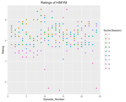
Suppose we want to construct a scatterplot of Rating (vertical scale) against Episode_Number (horizontal). We assign attributes or aesthetics to the variables in the data frame that we want to use in the plot.
- The variable Episode_Number will be the “x” aesthetic
- The variable Rating will be the “y” aesthetic
- The variable Season will be the color aesthetic
Next we decide what type of plotting object we want to use — this plotting object is called a geometric object or geom. Here our geometric object is a point which is represented by the function geom_point . We produce this graph by the syntax which produces the following display.
library(ggplot2)
ggplot(himym, aes(Episode_Number, Rating, color=factor(Season))) +
  geom_point() +
  ggtitle("User Ratings of HIMYM")
Faceting
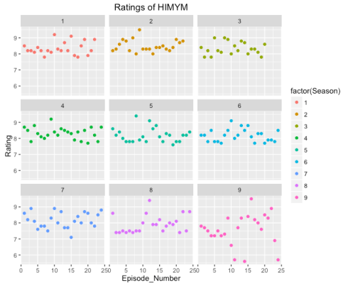
This first graph is hard to read since it is difficult to separate out the groups. In ggplot2 it is easy to break the graph into subpanels or facets. I can do this simply by adding the facet_wrap(~ Season) to my previous script. It is now easier to make comparisons of ratings between seasons.
ggplot(himym, aes(Episode_Number, Rating, color=factor(Season))) +
  geom_point() +
  facet_wrap(~ Season) +
  ggtitle("User Ratings of HIMYM")
Adding a Smooth
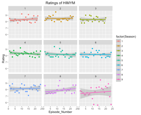
Since there is a lot of variation within a season, it might be helpful to plot a summary for each season to make it easier to compare. By adding geom_smooth(method="lm") we add a least-squares fit to each scatterplot.
ggplot(himym, aes(Episode_Number, Rating, color=factor(Season))) +
  geom_point() +
  facet_wrap(~ Season) +
  ggtitle("User Ratings of HIMYM") +
  geom_smooth(method="lm")
I think this last graph is very informative — we see how the ratings of HIMYM have changed over seasons and we can clearly see the unusual episodes (say in Season 9) which had unusually poor ratings.
The purpose of this first week’s post is give you a glimpse of the power of ggplot2 graphics. In future posts, I’ll illustrate the use of ggplot2 for the different types of data structures in our class.


Comments are closed.